Ah, business cards. Call me a weirdo, but I have a thing for well-designed business cards. Ok, you can stop snickering now. 1stwebdesigner posted a collection of ’em that are just dandy. Read more ›

Ah, business cards. Call me a weirdo, but I have a thing for well-designed business cards. Ok, you can stop snickering now. 1stwebdesigner posted a collection of ’em that are just dandy. Read more ›

Mac only: Adobe has competition (Yay!). Some designers have switched to other apps that offer faster workflows and more intuitive tools. One of them is Sketch—one of my favorite apps. Read more ›

Looks like the cat’s outta the bag regarding what Google looks for to rate a website for quality. Most of it is common sense, but it’s encouraging to see that quality is rewarded a better rating. For example, citing your sources strongly indicates trustworthiness. Read more ›

Sliders are eeeeeevil! Ok, maybe I’m exaggerating… a little. According to Tzvi Joffre at codeinwp, sliders can seriously slow down your website and distract your visitors among other things. Read more ›

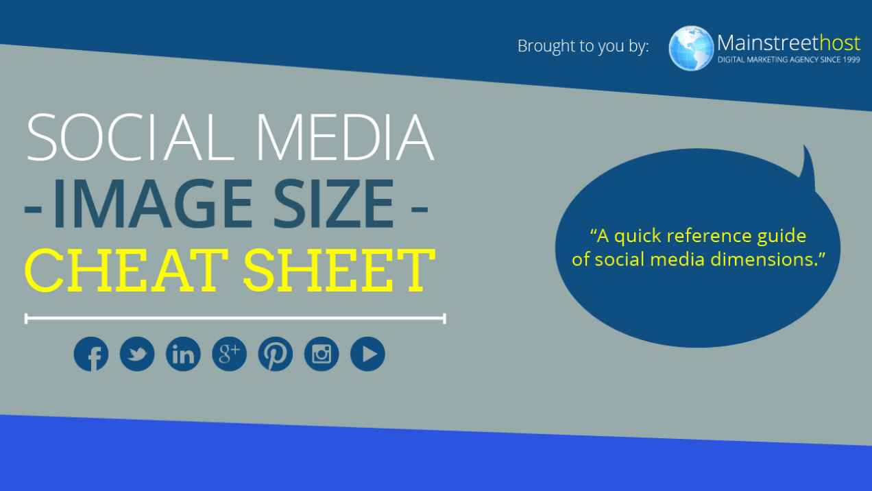
If you’re a social media juggler, you know it can be a hassle trying to make sure your brand image is consistent in each social network. So here’s a helpful infographic that can make it a little easier for you. Read more ›

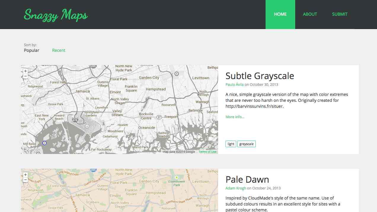
Maps can be a little boring sometimes ‘cuz they all look the same; or at their worst, can clash with the rest of the website’s colors. But here are a couple ways to liven them up to flow with your website’s color scheme and show your visitors that you go the extra mile. Read more ›

Ah, textures. They can add a tactile feeling to your website that ties everything together. Maybe you want a soft paper feel or even a gritty, urban one. Textures can be tricky to get right, especially if you need a seamless one to repeat across your website. Thankfully, here are 2 resources with quality textures for ya. Read more ›

Howdy, howdy. I hope you’re enjoying your July 4th weekend. 🙂
If your looking to get into web design, it’s a great industry to be in. Not only can you easily work remotely, but there’s always new stuff to learn and put together (like LEGO bricks) Read more ›
Big images can sloooow down your website. That’s bad news because it’ll annoy your website visitors and decrease their willingness to see your offers or buy from you.
But never fear, ImageOptim is a free, open-source Mac app that puts your images on a diet Read more ›

If you’re on a Mac and need to quickly grab colors off your screen, say “Hello” to my little friend Sip. It’s a wonderful free app that I wish I’d known about sooner. Read more ›