The web primarily consists of text. How do you know what typography to use? Hint: Not Comic Sans. 😉
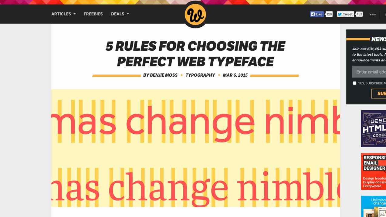
This week’s blip is from Benjie Moss on WebdesignerDepot where he shares 5 RULES FOR CHOOSING THE PERFECT WEB TYPEFACE. It’s like a primer for web typography; and a couple of tips include looking for fonts with large, open counters to improve legibility and that also have a consistent visual rhythm.
Bonus! After you get that lowdown, check out Font Pair to get some pre-matched Google Web fonts that can look great together on your next website.
5 RULES FOR CHOOSING THE PERFECT WEB TYPEFACE | WebdesignerDepot