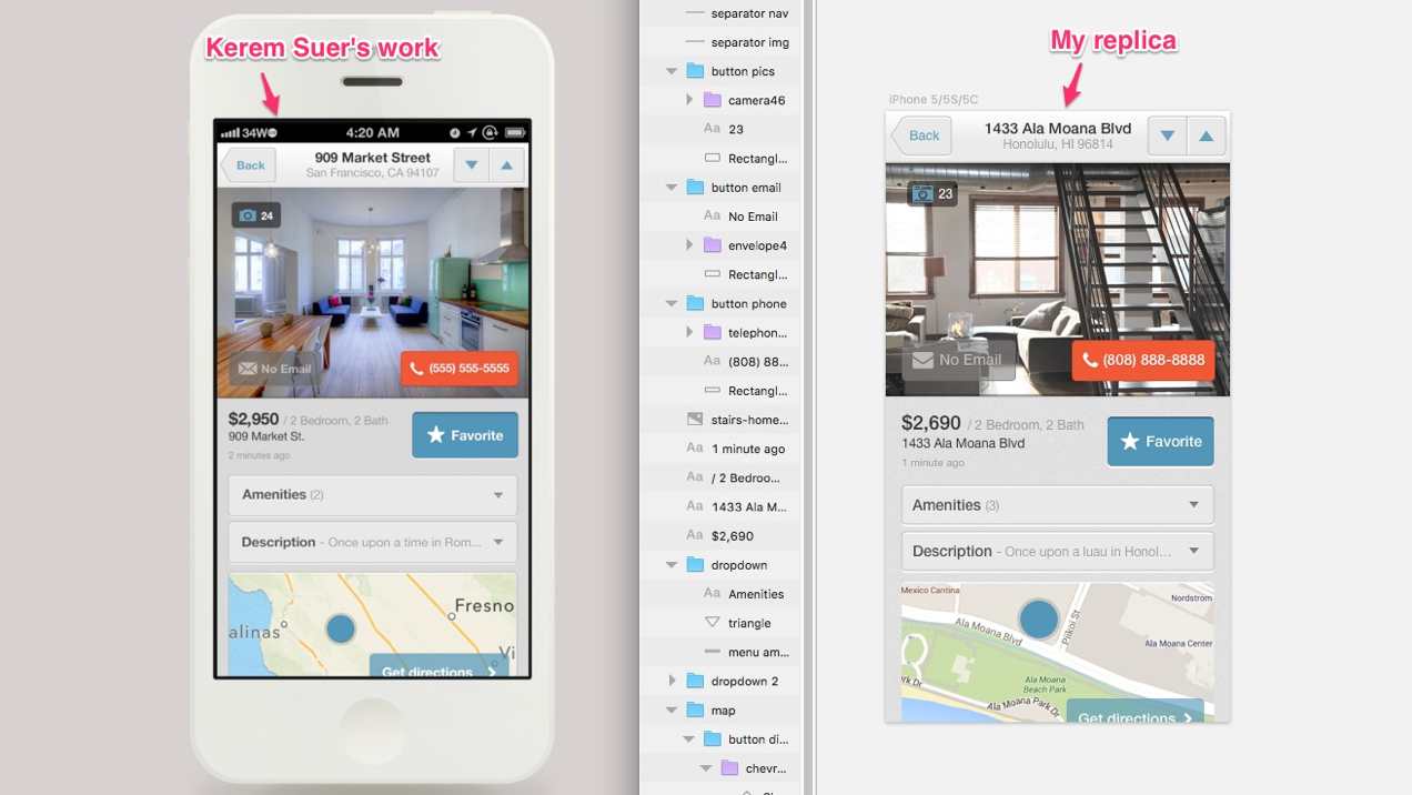
“Good artists copy; great artists steal”, so the quote goes. Mike Locke, a UI (user interface) and web designer, recommends copying your favorite designers to really grow one’s skills. So I gave it a shot by copying Kerem Suer.
But before we dive in, I wanna apologize for my lack of posts the past few weeks. Sometimes we just fall off the bandwagon, but we can get back on. I’ll aim to be more consistent about posting. 🙂
Back to the topic…
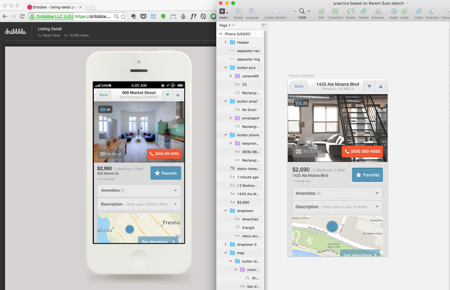
Kerem Suer is one of my favorite UI designers because of his use of subtle textures, muted colors, and simple designs. I tried my hand at copying the UI from his Dribble screenshot of a rental listing app. It took me a few hours to replicate and was a good learning experience because diving deep into his design showed me how subtle things like noise on a colored background or thin transition lines between content sections can add a bit of polish. Also lining content up does wonders, and it’s harder to do on a small screen like on a phone.
If you’re wanting to improve your UI or design skills, replicate a few of your favorite designs for practice (no plagiarizing, of course) and see what you learn.
Btw, here’s a higher quality screenshot of my UI-copying attempt:

