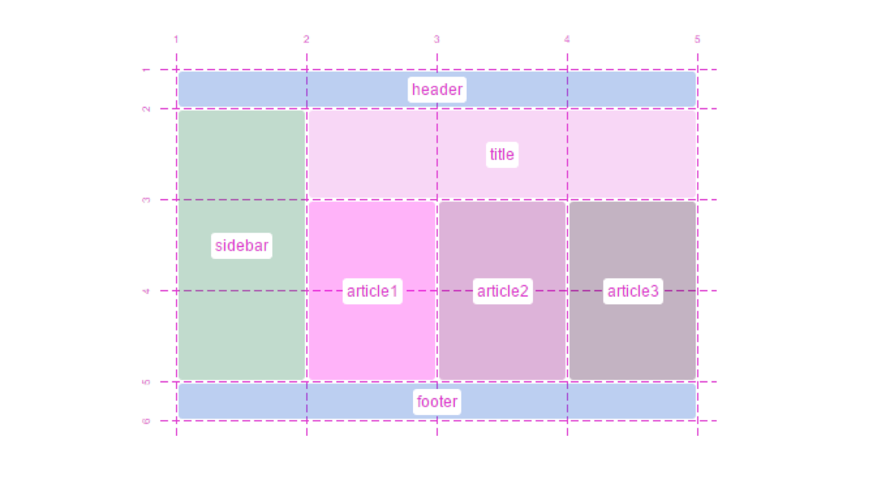
Today we’re talking CSS layouts—bleeding edge version. Specifically CSS Grid Layout. Grids are one of the best tools for designers to organize content beautifully and give visitors meaningful context; but implementing them in CSS is cumbersome at best. That’ll change in the future though.
Patrick Brosset shares in a blogpost some of the cool things CSS Grid Layout will do and shares some videos of talks about it. It’ll save a lot of unnecessary HTML and CSS code and reduce the need to rearrange its markup.
Unfortunately CanIUse.com says 8.57% browsers support CSS Grid Layout at the time of this post’s publication. So for now flexbox is a great alternative to it (Scotch.io has a good flexbox intro). That said, it’s good to see what’s coming down the pipeline for CSS.
The future of layout with CSS: Grid Layouts | via The Web Designer newsletter 58th ed.
