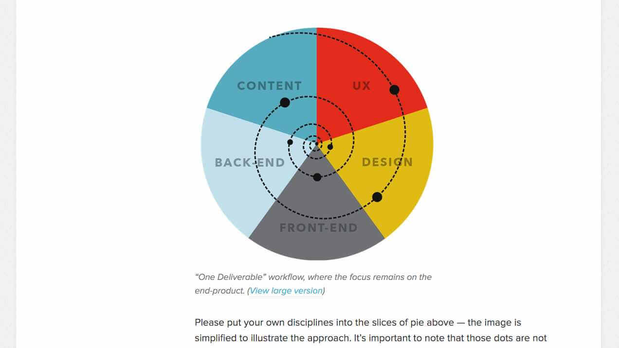
Designing a website responsively encompasses a lot of stuff, not just coding. Things like gathering content, collaborating with clients and coworkers, reiterating designs, so on and so forth. Today’s link here helps to deal with that complexity and is quite meaty (but still vegetarian friendly). 😉
Ben Callahan wrote a Smashing Magazine blogpost titled “Efficient Responsive Design Process“; and I highly recommend it because it deals with a ton of stuff. No joke. From prioritizing work, to how design projects spiral through different stages, to collaborating with clients. It’s a veeeery long post (about an hour to read); but worth it.
One of the tips I gleaned is to use something called a content priority guide. It’s like an outline for webpage content that’s written with client collaboration using something like a Google Doc. Something like this can help everyone to order the different content’s priorities.
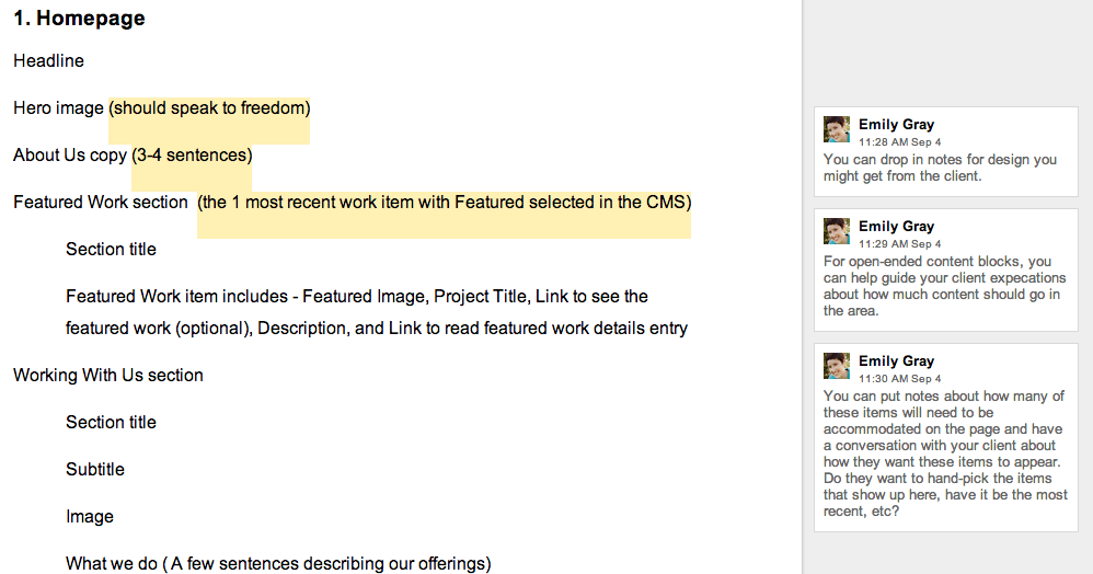
(Example of Content Priority Guide from the Smashing Magazine blogpost)
If you’re a web designer, set aside 1 hour to read the post because you will probably gain a few solid insights to improve how you work.
Efficient Responsive Design Process | Smashing Magazine