You’ve heard the saying, “Form over function”; but for your website visitors, form is a part of function. A web form is something that looks easy; but is difficult to get right. But here’s an excellent blogpost on “The 10 Commandments of Good Form Design on the Web”.
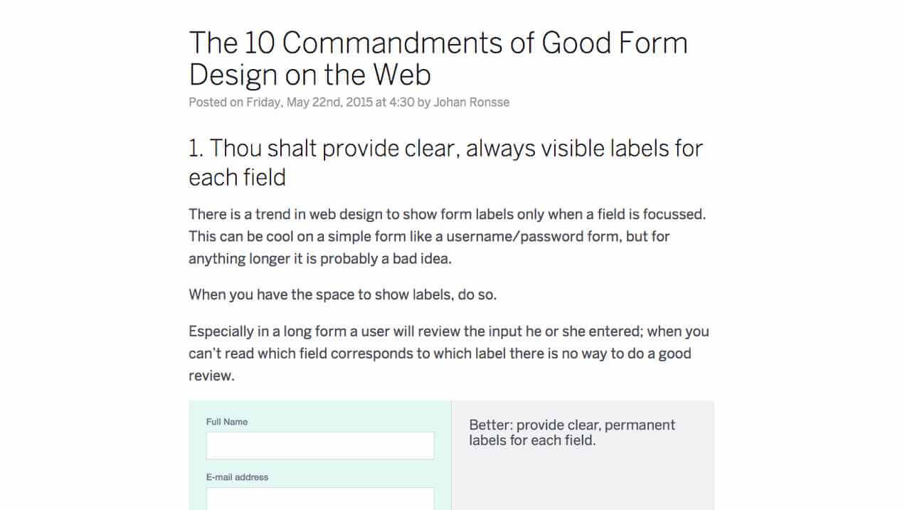
In it, Johan Ronsse put together bite-sized chunks of principles and animated GIFs to show how to upgrade your form’s usability. For instance, for touch devices he recommends having tappable areas between 32-40px in height to account for imprecise finger taps. He also shows how to validate data and flag errors without exasperating your visitors. All the tips are good to know.